These days, with technology driving your customers to seek information that is quick, visually attractive, engaging, and to the point, it has never been more important to create effective outreach materials. Fortunately, there are a few things you can do to increase your chances success. Below is a list of the most common mistakes that we see in outreach materials:
1. Too much text: Too much text can cause your audience to tune out before they have even started reading. Before starting development of your materials list out one to three main ideas you need your customer to take away. Only including information relevant to those main ideas is key. Having a second set of eyes review and edit your text can be really helpful, too.
2. Low resolution photos: Photos are still worth a thousand words. Take the time to make sure the photos you are using are high resolution. A good rule of thumb is to make sure the file size is a minimum of 1MB. The higher the resolution, the crisper the photo will print.
3. Photo subject doesn’t match the message: An example of this is a rate increase. Including photos of kids playing at a local park might not be the best choice (unless the rate increase is going to pay for parks, of course). Customers can see right through an effort to “hide” the truth. Be transparent, be honest, and only include photos that will help your customer understand your message.
4. Clip art: Simple clip art might have its place somewhere, but including graphics that match your message, are eye catching and look professional draws the customer in. Though they typically come with a price tag, the value often outweighs the cost.
5. Contrasting color themes: Way back in elementary school, we all learned about colors and the color wheel. Maybe later in art class, you learned about complimentary colors and contrasting colors. When designing outreach pieces, the principal is the same. Make sure you are choosing colors that complement each other and speak to the purpose of your material.
6. Lack of focus: Keep your customers engaged so they hear you. Focus on one or two main ideas and get right to the point! Outreach specialists often have many messages to convey. It is tempting to include as many as possible into a single outreach piece. This will create an unintended consequence: your customers will tune out completely. Quick and focused ideas are not only easier to digest, they are what your customers are seeking.
7. Use of crazy fonts: When it comes to attracting your customers, let the graphics, colors and layout do the work. Use a simple and familiar font for the text. With a nearly endless amount of fonts at our fingertips, it can be tempting to incorporate the craziest font to attract your customers. Unfortunately, the more extreme your font, the more likely you will deter your audience.
8. Use of different fonts: If you are designing a brochure, use no more than one or two fonts. A similar issue to using awkward, crazy, fonts is using many different fonts. It is important to keep the font simple and familiar.
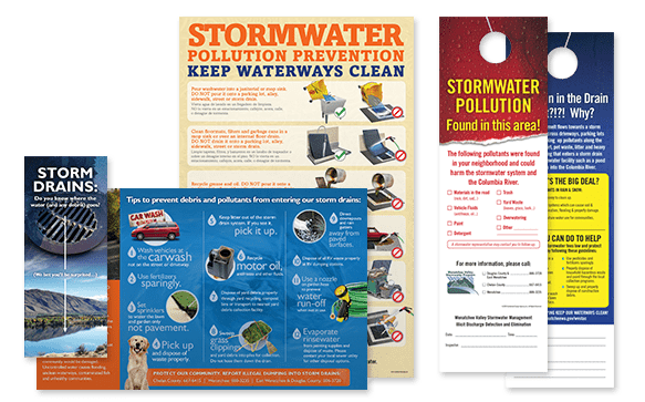
9. Product doesn’t match the purpose: Spend some time really thinking about who you need to send the message to and the best way to reach them. If you are trying to send a message that applies to all of your customers, a bill stuffer might be a great way to do that. If you only need to reach a few neighborhoods, a door hanger might be a better choice.
10. Spending Too Much Time: Many of us might be great communicators, but lack graphic design ability. Without the skill, knowledge and tools of a graphic designer to create great outreach materials, you might find yourself spending 3 or 4 times the hours a graphic designer would spend. Consider your budget early on, and decide if it might actually be more cost effective to bring in a professional to lay out your vision for you!